Style Guidelines Of
Style Guidelines Of
Industrial Design Conference
Industrial Design Conference
A comprehensive guideline outlines the process of maintaining brand identity, provides instructions for applying the style to futuristic appliances, specifies what is allowed and forbidden, and sets a theme for creating a cohesive brand.
A comprehensive guideline outlines the process of maintaining brand identity, provides instructions for applying the style to futuristic appliances, specifies what is allowed and forbidden, and sets a theme for creating a cohesive brand.
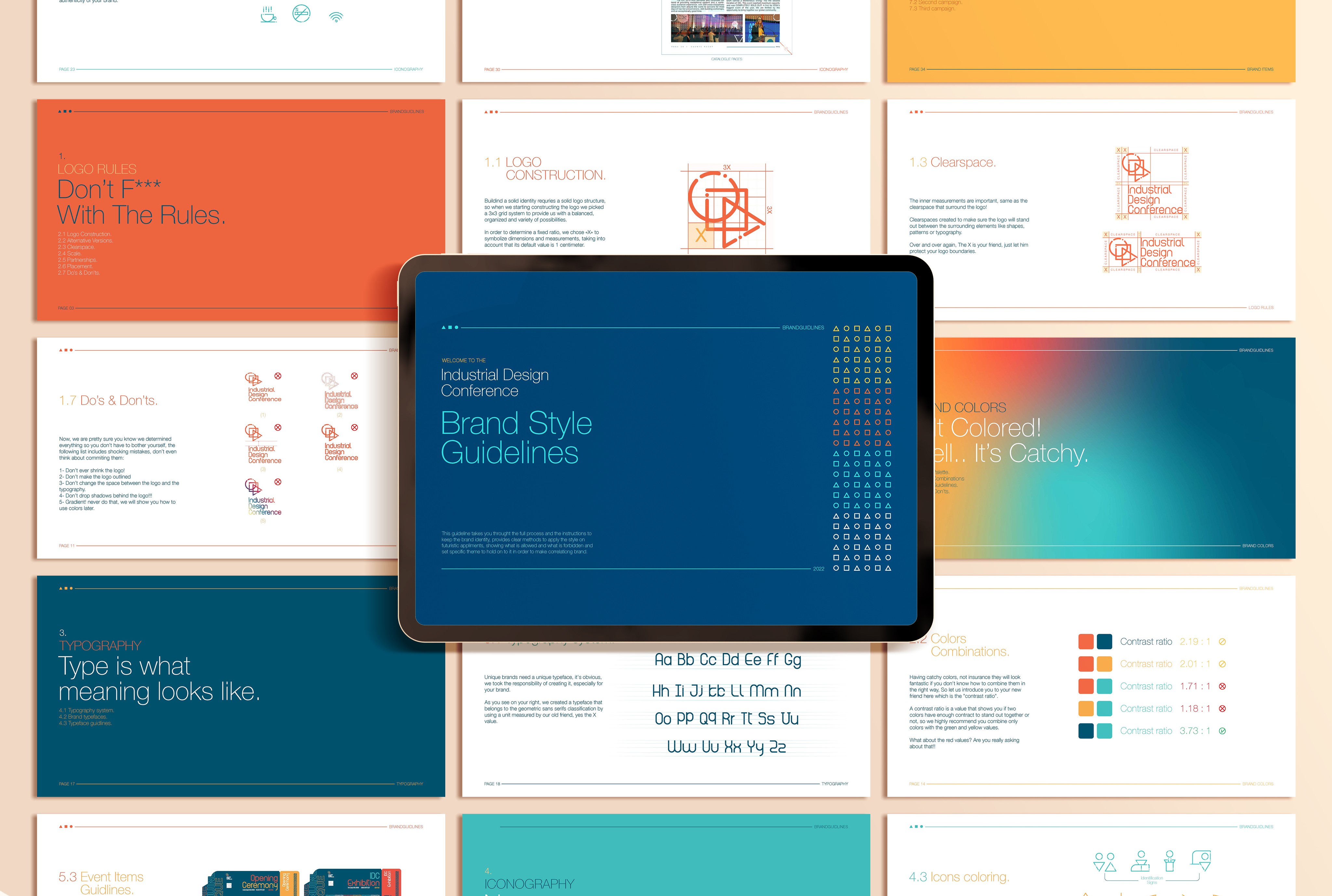
Brand Style Guidelines
Brand Style Guidelines
Brand Style Guidelines
Usage Instructions
Usage Instructions
Usage Instructions
Do's & Don'ts
Do's & Don'ts
Do's & Don'ts


Table Of Contents
1.Logo Rules
Logo Construction.
Alternative Version.
Scale.
Clear space.
Partnerships.
Placement.
Do’s & Don’ts.
Logo Construction.
Alternative Version.
Scale.
Clear space.
Partnerships.
Placement.
Do’s & Don’ts.
Logo Construction.
Alternative Version.
Scale.
Clear space.
Partnerships.
Placement.
Do’s & Don’ts.
2.Brand Colors
Color Palette.
Colors Combinations.
Color Guidelines.
Do’s & Don’ts.
Color Palette.
Colors Combinations.
Color Guidelines.
Do’s & Don’ts.
Color Palette.
Colors Combinations.
Color Guidelines.
Do’s & Don’ts.
3.Typography
Brand typefaces.
Typography system.
Pairings.
Pairings guidlines.
Typeface guidlines.
Brand typefaces.
Typography system.
Pairings.
Pairings guidlines.
Typeface guidlines.
4.Iconography
Icons pack.
Icons guidelines.
Icons coloring.
Icons pack.
Icons guidelines.
Icons coloring.
5.Printables
Stationery Guidelines.
Catalouge & Flyers.
Event Items Guidlines.
Stationery Guidelines.
Catalouge & Flyers.
Event Items Guidlines.
6.Advertising
First campaign.
Second campaign.
Third campaign.
First campaign.
Second campaign.
Third campaign.
1.
Logo Rules
Don’t Mess
With The Rules.
Don’t Mess
With The Rules.
Don’t Mess
With The Rules.
1.1 Logo
Construction.
1.1 Logo
Construction.
1.1 Logo
Construction.
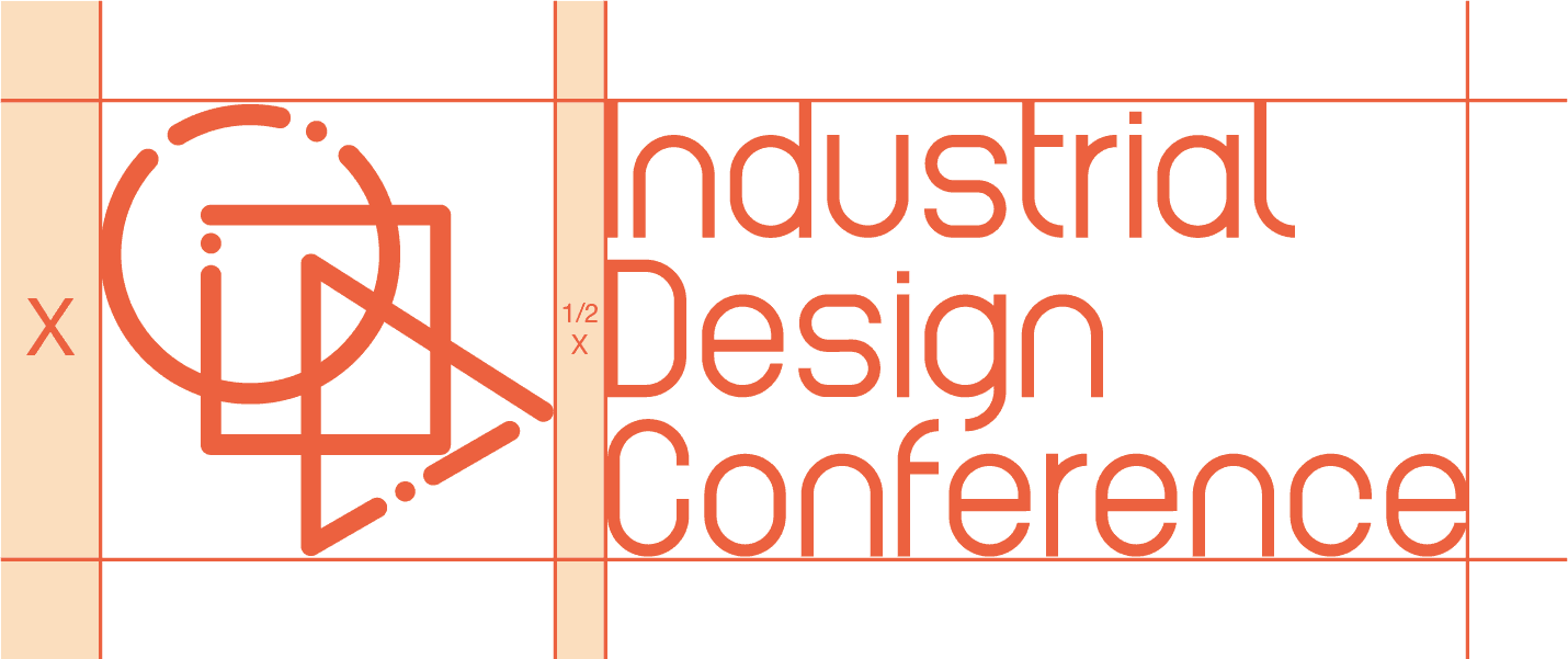
Building a solid identity requires a solid logo structure, so when we started constructing the logo we picked a 3x3 grid system to provide us with a balanced, organized and variety of possibilities.
In order to determine a fixed ratio, we chose «X» to symbolize dimensions and measurements, taking into account that its default value is 1 centimeter.

1.1 Logo
Construction.
1.1 Logo
Construction.
1.1 Logo
Construction.
After determining the shape of the pictorial logo, the X value was used again to determine the relation between the logo and the typography.
While the ratio between them was 1/2 X, The ratio between their sizes was 1:1.75 in the vertical logo option.
After determining the shape of the pictorial logo, the X value was used again to determine the relation between the logo and the typography.
While the ratio between them was 1/2 X, The ratio between their sizes was 1:1.75 in the vertical logo option.
After determining the shape of the pictorial logo, the X value was used again to determine the relation between the logo and the typography.
While the ratio between them was 1/2 X, The ratio between their sizes was 1:1.75 in the vertical logo option.

1.2 Alternative
Versions.
1.2 Alternative
Versions.
1.2 Alternative
Versions.
When it comes to the horizontal option, we decided to stick with the same ratio we already determined in the vertical option in order to keep the balance we created previously.
When it comes to the horizontal option, we decided to stick with the same ratio we already determined in the vertical option in order to keep the balance we created previously.
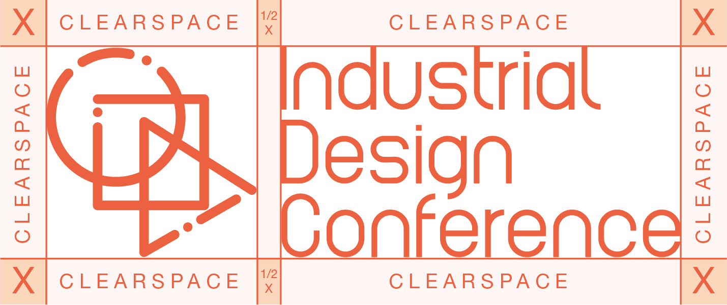
1.3 Clear space.
1.3 Clear space.
1.3 Clear space.
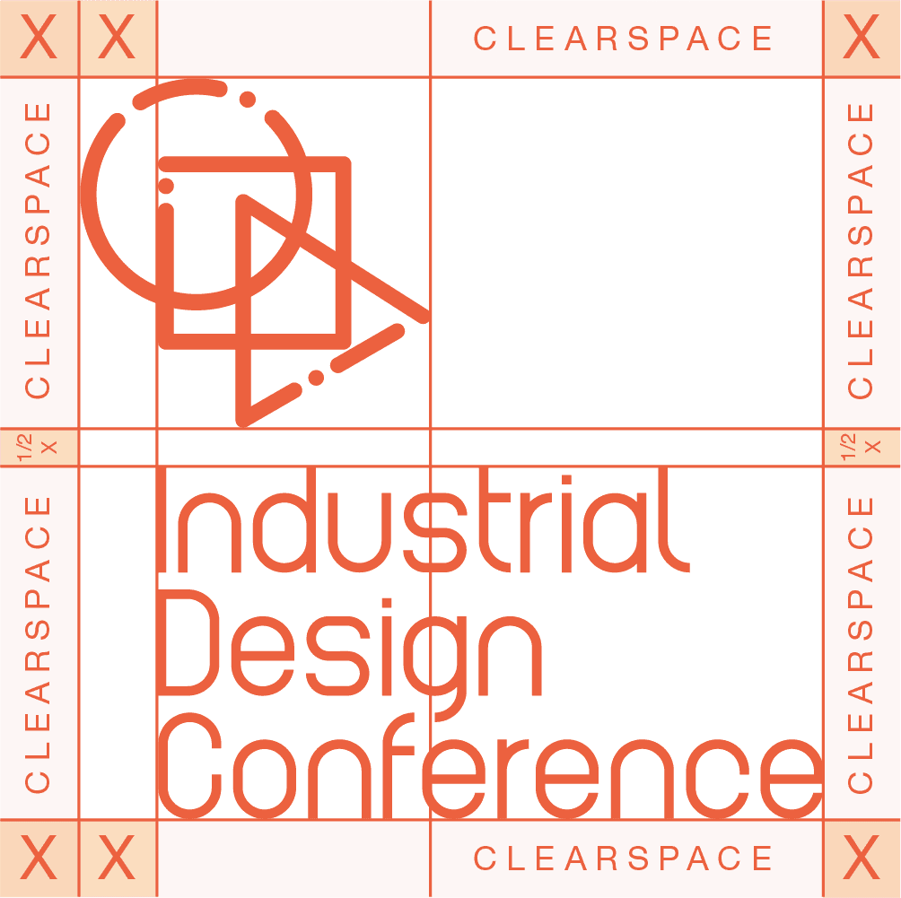
The inner measurements are important, just as the clear space that surround the logo!
Clear spaces are created to make sure the logo will stand out between the surrounding elements like shapes, patterns or typography.
Over and over again, The X is your friend, just let him protect your logo boundaries.
1.4 Scale.
1.4 Scale.
1.4 Scale.
We took care of all measurements on your behalf to make the logo ready to use however you want.
The logo is scalable in any size you want without clearity. BUT! we highly recommend you consider the X value -which is 1 centimeter in case you forgot- as your minimum height.
We took care of all measurements on your behalf to make the logo ready to use however you want.
The logo is scalable in any size you want without clearity. BUT! we highly recommend you consider the X value -which is 1 centimeter in case you forgot- as your minimum height.
We took care of all measurements on your behalf to make the logo ready to use however you want.
The logo is scalable in any size you want without clearity. BUT! we highly recommend you consider the X value -which is 1 centimeter in case you forgot- as your minimum height.

1.5 Partnerships.
1.5 Partnerships.
1.5 Partnerships.
Partnerships are such a wonderful factor in your success, -we have no doubts- but your identity is who you are.
In order to make sure your logo stands out clearly beside your partners ,keep the X value between your logos, winners always stand out clearly!
Partnerships are such a wonderful factor in your success, -we have no doubts- but your identity is who you are.
In order to make sure your logo stands out clearly beside your partners ,keep the X value between your logos, winners always stand out clearly!
Partnerships are such a wonderful factor in your success, -we have no doubts- but your identity is who you are.
In order to make sure your logo stands out clearly beside your partners ,keep the X value between your logos, winners always stand out clearly!

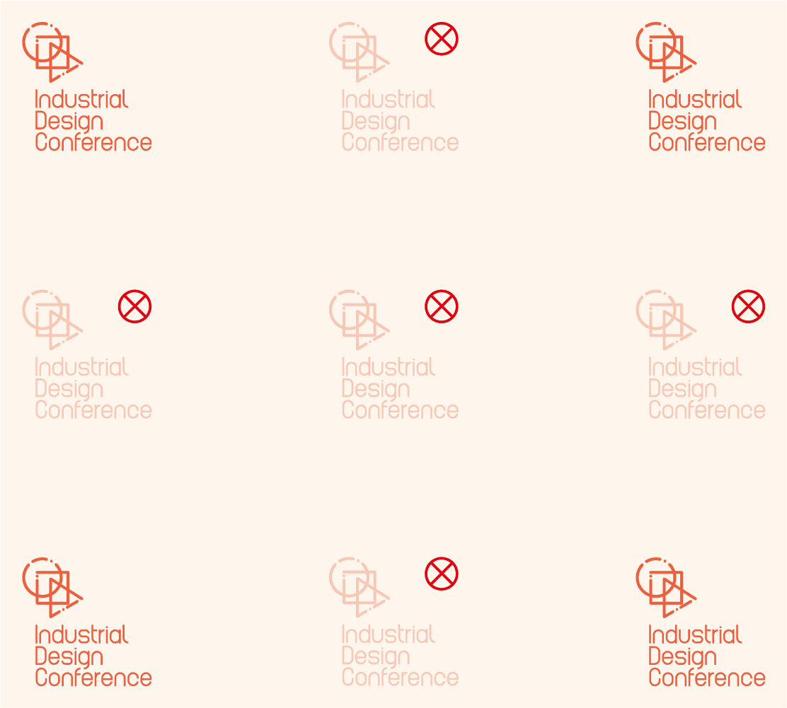
1.6 Placement.
1.6 Placement.
1.6 Placement.
You resized the logo within the limits we recommended? Amazing, now let us tell you where are the most appropriate places to put your logo..
As You see in the following shapes we cut down the opacity for the logos that are located in places we don’t recommend you putting the logo in.
You resized the logo within the limits we recommended? Amazing, now let us tell you where are the most appropriate places to put your logo..
As You see in the following shapes we cut down the opacity for the logos that are located in places we don’t recommend you putting the logo in.
You resized the logo within the limits we recommended? Amazing, now let us tell you where are the most appropriate places to put your logo..
As You see in the following shapes we cut down the opacity for the logos that are located in places we don’t recommend you putting the logo in.
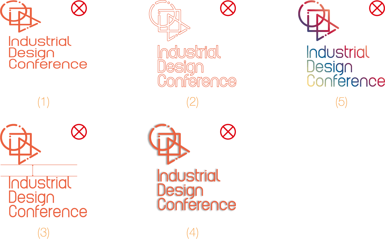
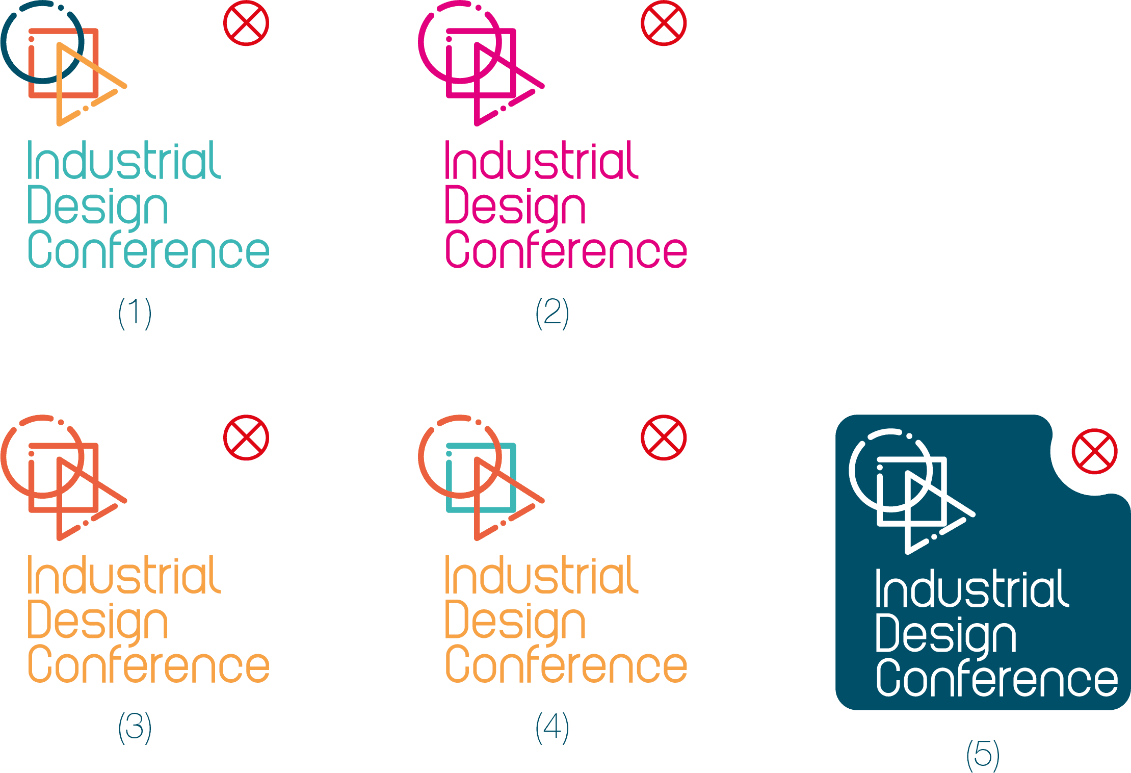
1.7 Do’s & Don’ts.
1.7 Do’s & Don’ts.
1.7 Do’s & Don’ts.
Now, we are pretty sure you know we determined everything so you don’t have to bother yourself, the following list includes shocking mistakes, don’t even think about committing them:
1- Don’t ever shrink the logo!
2- Don’t make the logo outlined
3- Don’t change the space between the logo and the typography.
4- Don’t drop shadows behind the logo!!!
5- Gradient! never do that, we will show you how to use colors later.
2.
Brand Colors
Is It Colored!
Well.. It’s Catchy.
Is It Colored!
Well.. It’s Catchy.
Is It Colored!
Well.. It’s Catchy.
2.1 Color Palette.
2.1 Color Palette.
2.1 Color Palette.
Picking the identity colors can be a tricky process, it should be attractive enough, have a decent amount of contrast, and be unique enough to stand out from other brands.
We decided to use multiple values of the complementary color harmony rules in order to provide a variety of colors and a wider range of tones.
CMYK: 100 30 25 50
RGB: 0 79 104
HSB: 195 100 40
HEX: 004f68
Dark Blue
CMYK: 70 0 35 0
RGB: 61 184 183
HSB: 180 65 70
HEX: 3db8b7
Teal
CMYK: 0 75 75 0
RGB: 236 97 63
HSB: 11 75 92
HEX: ec613f
Reddish Orange
Reddish
Orange
Reddish
Orange
CMYK: 0 45 80 0
RGB: 246 162 69
HSB: 30 71 95
HEX: f6a245
Orange
2.2 Colors
Combinations.
2.2 Colors
Combinations.
2.2 Colors
Combinations.
Having catchy colors is not enough proof they will look good if you don't know how to combine them in the right way, So let us introduce you to your new friend here which is the "contrast ratio".
A contrast ratio is a value that shows you if two colors have enough contrast to stand out against one other, so we highly recommend you combine only colors with the green and yellow values.
Contrast ratio 4.39 : 1
Contrast ratio 3.77 : 1
Contrast ratio 2.74 : 1
Contrast ratio 1.6 : 1
Contrast ratio 1.38 : 1
2.3 Colors
Guidelines.
2.3 Colors
Guidelines.
2.3 Colors
Guidelines.
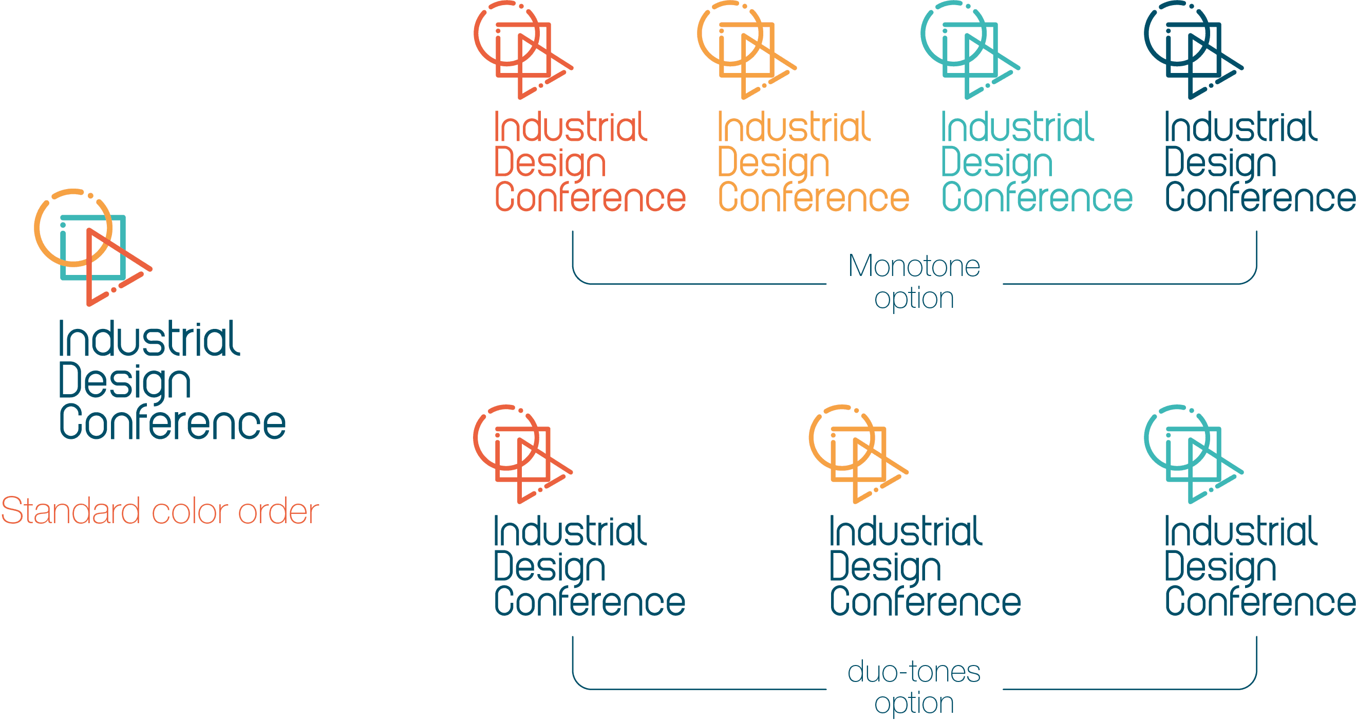
After you met your brand colors let's talk about how you should use them when it comes to the logo.
You can use the brand colors in the same order we are showing you on the right as the standard color option for your brand.
Also, you can make use a monotone or a duotone from your brand colors.
After you met your brand colors let's talk about how you should use them when it comes to the logo.
You can use the brand colors in the same order we are showing you on the right as the standard color option for your brand.
Also, you can make use a monotone or a duotone from your brand colors.
2.4 Do’s & Don’ts.
2.4 Do’s & Don’ts.
2.4 Do’s & Don’ts.
We think you already know the rules when it comes to this section, so let's make it clear:
1- Don't change the order of the colors when it comes to the standard logo option.
2- Don't even think about using a color that isn't included within your brand colors.
3-Stick with the duotones options we showed you earlier.
4- Any try to create a tri-tone option is rejected.
5- A colored shape combined with the logo? seriously!!
3.
Typography
Type is what
meaning looks like.
Type is what
meaning looks like.
Type is what
meaning looks like.
3.1 Typography
system.
3.1 Typography
system.
3.1 Typography
system.
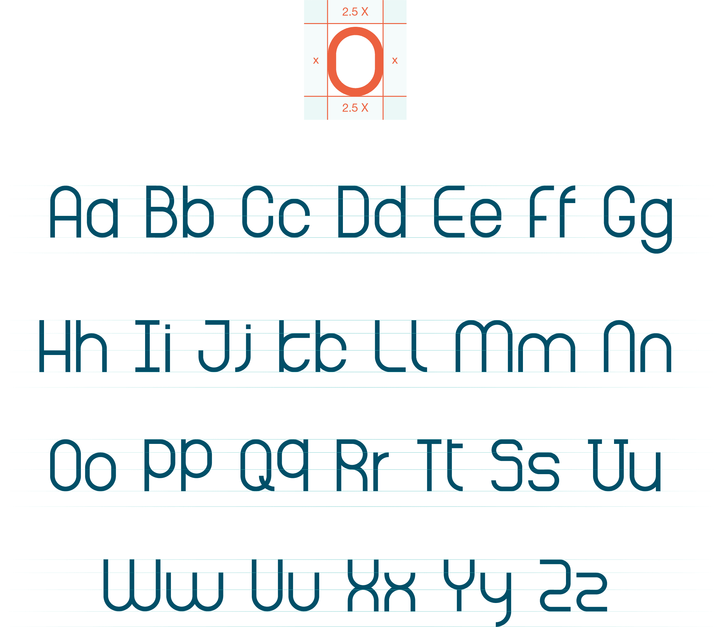
Unique brands need unique typeface, it's obvious, we took the responsibility of creating it, especially for your brand.
As you see on your right, we created a typeface that belongs to the geometric sans serifs classification by using a unit measured by our old friend, yes the X value.
Unique brands need unique typeface, it's obvious, we took the responsibility of creating it, especially for your brand.
As you see on your right, we created a typeface that belongs to the geometric sans serifs classification by using a unit measured by our old friend, yes the X value.
3.1 Typography
system.
3.1 Typography
system.
3.1 Typography
system.
Building a solid identity requires a solid logo structure, so when we started constructing the logo we picked a 3x3 grid system to provide us with a balanced, organized and variety of possibilities.
In order to determine a fixed ratio, we chose «X» to symbolize dimensions and measurements, taking into account that its default value is 1 centimeter.


3.2 Brand
typefaces.
3.2 Brand
typefaces.
3.2 Brand
typefaces.
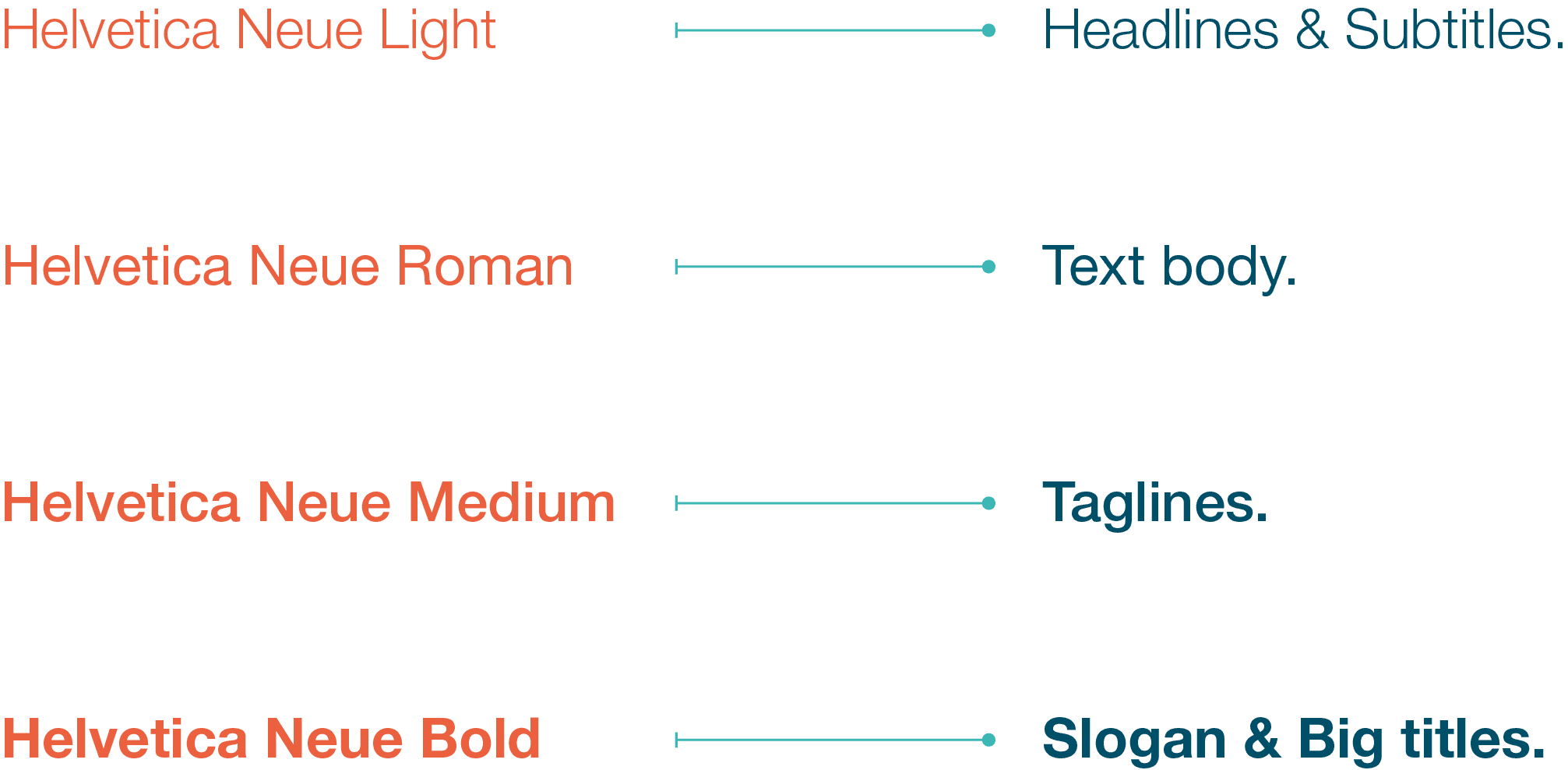
You don't know what Helvetica is! please step down and deliver this file to someone who knows it.
Now since we are talking to someone who has enough knowledge to follow up with the brand rules, we bet you know how amazing Helvetica will be as a secondary typeface for your brand.
We know that Helvetica includes more than 100 weights, we just picked these 4 weights for you to use in your brand.
Helvetica Light
Helvetica Light
Helvetica Light
Aa Bb Cc Dd Ee Ff Gg Hh Ii Jj Kk Ll Mm Nn Oo Pp Qq Rr Ss Tt Uu Vv Ww Xx Yy Zz
0 1 2 3 4 5 6 7 8 9
Aa Bb Cc Dd Ee Ff Gg Hh Ii Jj Kk Ll Mm Nn Oo Pp Qq Rr Ss Tt Uu Vv Ww Xx Yy Zz
0 1 2 3 4 5 6 7 8 9
Aa Bb Cc Dd Ee Ff Gg Hh Ii Jj Kk Ll Mm Nn Oo Pp Qq Rr Ss Tt Uu Vv Ww Xx Yy Zz
0 1 2 3 4 5 6 7 8 9
Helvetica Roman
Helvetica Roman
Helvetica Roman
Aa Bb Cc Dd Ee Ff Gg Hh Ii Jj Kk Ll Mm Nn Oo Pp Qq Rr Ss Tt Uu Vv Ww Xx Yy Zz
0 1 2 3 4 5 6 7 8 9
Aa Bb Cc Dd Ee Ff Gg Hh Ii Jj Kk Ll Mm Nn Oo Pp Qq Rr Ss Tt Uu Vv Ww Xx Yy Zz
0 1 2 3 4 5 6 7 8 9
Aa Bb Cc Dd Ee Ff Gg Hh Ii Jj Kk Ll Mm Nn Oo Pp Qq Rr Ss Tt Uu Vv Ww Xx Yy Zz
0 1 2 3 4 5 6 7 8 9
Helvetica Medium
Helvetica Medium
Helvetica Medium
Aa Bb Cc Dd Ee Ff Gg Hh Ii Jj Kk Ll Mm Nn Oo Pp Qq Rr Ss Tt Uu Vv Ww Xx Yy Zz
0 1 2 3 4 5 6 7 8 9
Aa Bb Cc Dd Ee Ff Gg Hh Ii Jj Kk Ll Mm Nn Oo Pp Qq Rr Ss Tt Uu Vv Ww Xx Yy Zz
0 1 2 3 4 5 6 7 8 9
Aa Bb Cc Dd Ee Ff Gg Hh Ii Jj Kk Ll Mm Nn Oo Pp Qq Rr Ss Tt Uu Vv Ww Xx Yy Zz
0 1 2 3 4 5 6 7 8 9
Helvetica Bold
Helvetica Bold
Helvetica Bold
Aa Bb Cc Dd Ee Ff Gg Hh Ii Jj Kk Ll Mm Nn Oo Pp Qq Rr Ss Tt Uu Vv Ww Xx Yy Zz
0 1 2 3 4 5 6 7 8 9
Aa Bb Cc Dd Ee Ff Gg Hh Ii Jj Kk Ll Mm Nn Oo Pp Qq Rr Ss Tt Uu Vv Ww Xx Yy Zz
0 1 2 3 4 5 6 7 8 9
Aa Bb Cc Dd Ee Ff Gg Hh Ii Jj Kk Ll Mm Nn Oo Pp Qq Rr Ss Tt Uu Vv Ww Xx Yy Zz
0 1 2 3 4 5 6 7 8 9
3.3 Typeface
guidelines.
3.3 Typeface
guidelines.
3.3 Typeface
guidelines.
Why do we pick 4 weights? have you ever heard of hierarchy? simply it is a way to clarify the priority of the different design elements and their importance.
We defined which weight fits which usage to achieve the best hierarchy when it comes to the typographic elements.
Why do we pick 4 weights? have you ever heard of hierarchy? simply it is a way to clarify the priority of the different design elements and their importance.
We defined which weight fits which usage to achieve the best hierarchy when it comes to the typographic elements.
4.
Iconography
Never
Get Lost.
Never
Get Lost.
Never
Get Lost.
4.1 Icons pack.
4.1 Icons pack.
4.1 Icons pack.
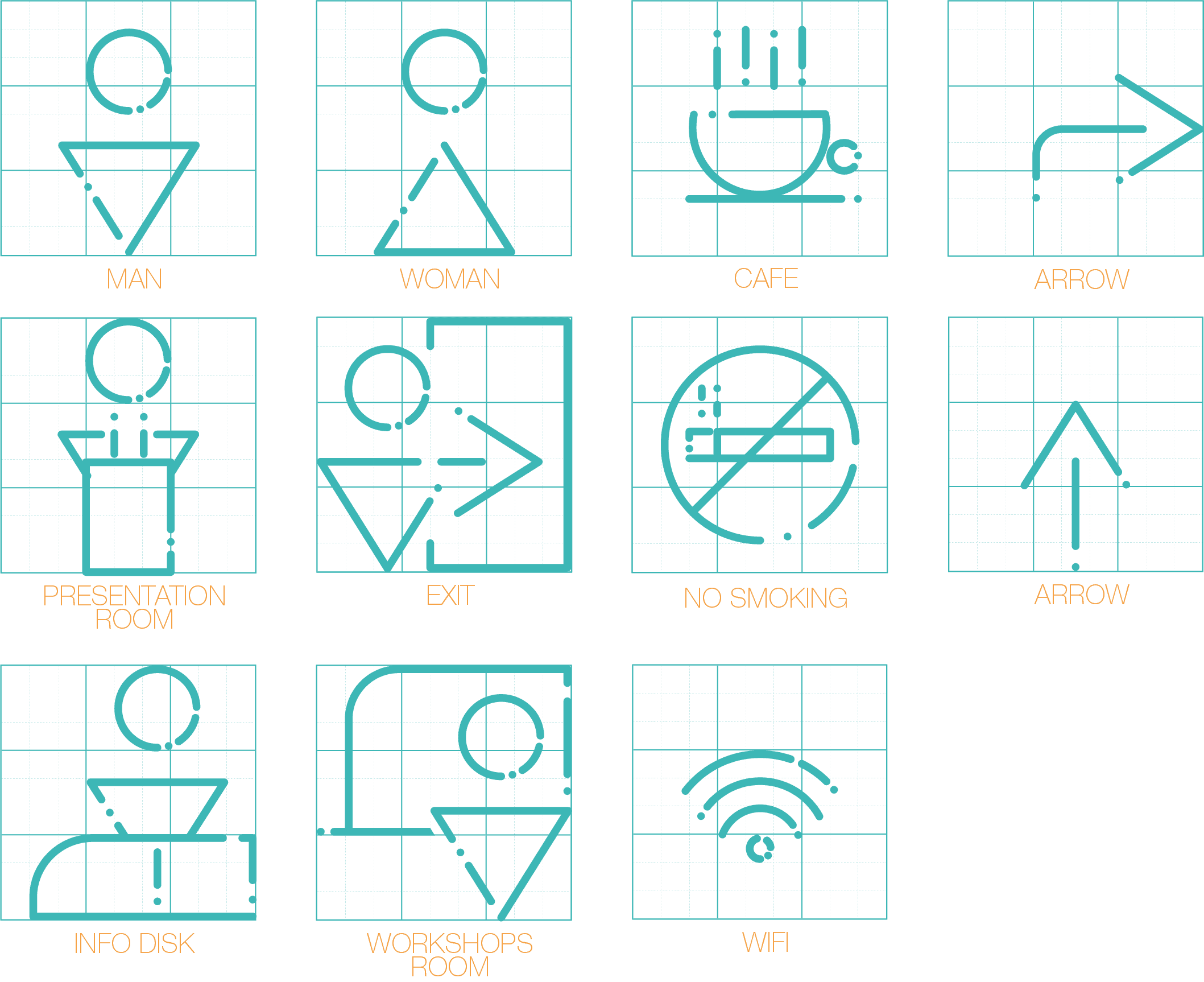
Icons are an essential addition to any brand, it's an international language people can understand without words.
we created an icons pack for you with a style that matches your identity in order to deliver the authenticity of your brand.
Icons are an essential addition to any brand, it's an international language people can understand without words.
we created an icons pack for you with a style that matches your identity in order to deliver the authenticity of your brand.

4.2 Icons
guidelines.
4.2 Icons
guidelines.
4.2 Icons
guidelines.
Both the grid system and style are keys to ensure that any icon that will be created later will fit perfectly with the rest of the icons.
So we highly encourage you to spend a bit of time understating that simple gird system before you try to create any new icons.
Both the grid system and style are keys to ensure that any icon that will be created later will fit perfectly with the rest of the icons.
So we highly encourage you to spend a bit of time understating that simple gird system before you try to create any new icons.
4.3 Icons
coloring.
4.3 Icons
coloring.
4.3 Icons
coloring.
Colors are a powerful way to deliver meanings, so when it comes to classifying the icons each color meaning should match the classification of the icon assigned.
Picking colors in a way different than what we already classified on the right isn't allowed.
Colors are a powerful way to deliver meanings, so when it comes to classifying the icons each color meaning should match the classification of the icon assigned.
Picking colors in a way different than what we already classified on the right isn't allowed.

5.
Printables
Always
Remember Us!
Always
Remember Us!
Always
Remember Us!
5.1 Stationery
Guidelines.
5.1 Stationery
Guidelines.
5.1 Stationery
Guidelines.
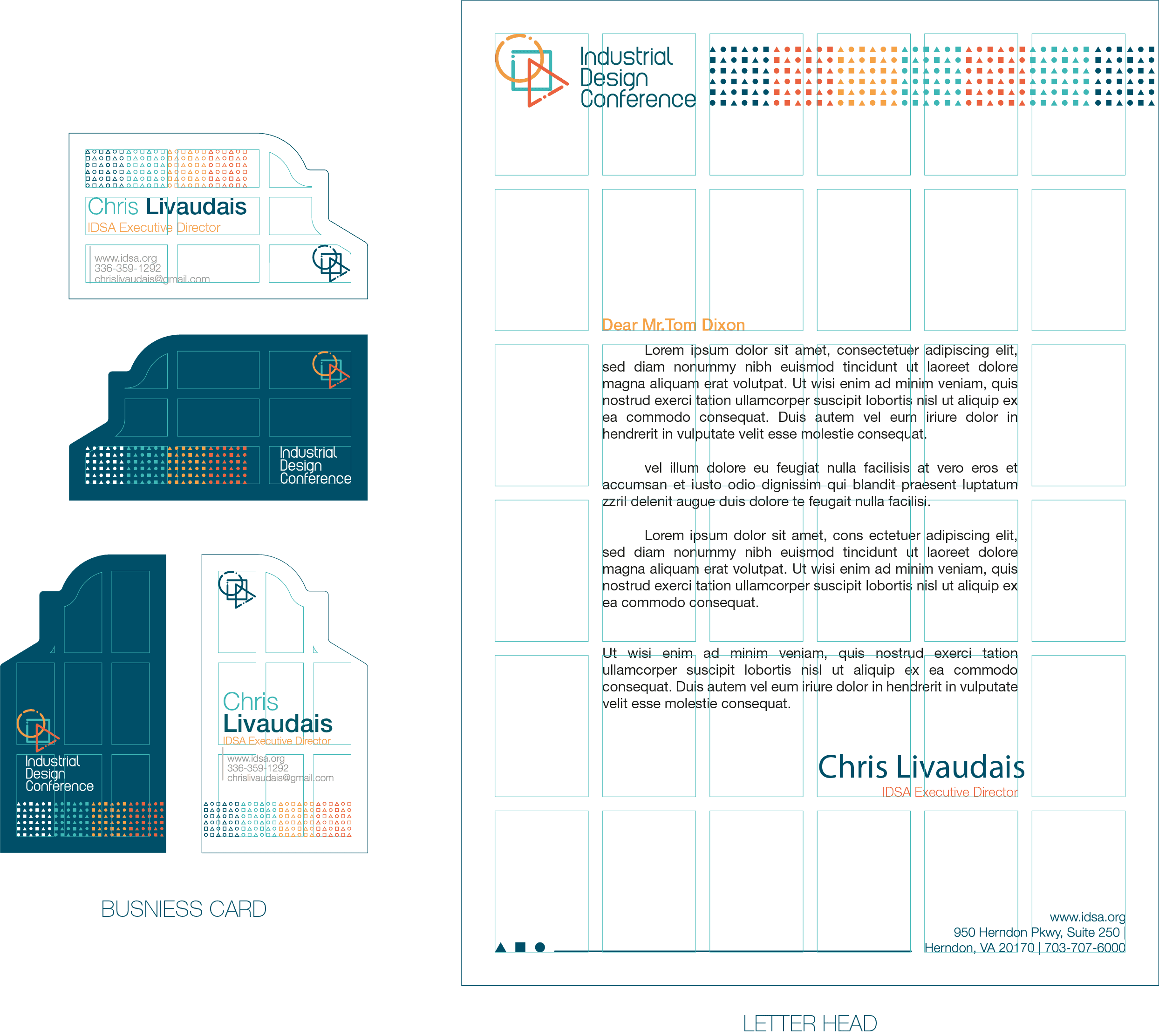
Designing clean stationery requires a grid system to connect all of them visually together.
The following examples show the grid system of the brand stationery which is 3x3 in small items like business cards, or 6x6 when it comes to bigger items like letterhead & envelopes.
Designing clean stationery requires a grid system to connect all of them visually together.
The following examples show the grid system of the brand stationery which is 3x3 in small items like business cards, or 6x6 when it comes to bigger items like letterhead & envelopes.
5.2 Catalouge
& Flyers.
5.2 Catalouge
& Flyers.
5.2 Catalouge
& Flyers.
Catalouge is your brand book, it should include everything that lets people know about your brand, starting from its size and the grid system, ending with the content of your catalogue.
Catalouge is your brand book, it should include everything that lets people know about your brand, starting from its size and the grid system, ending with the content of your catalogue.
5.2 Catalouge
& Flyers.
5.2 Catalouge
& Flyers.
5.2 Catalouge
& Flyers.
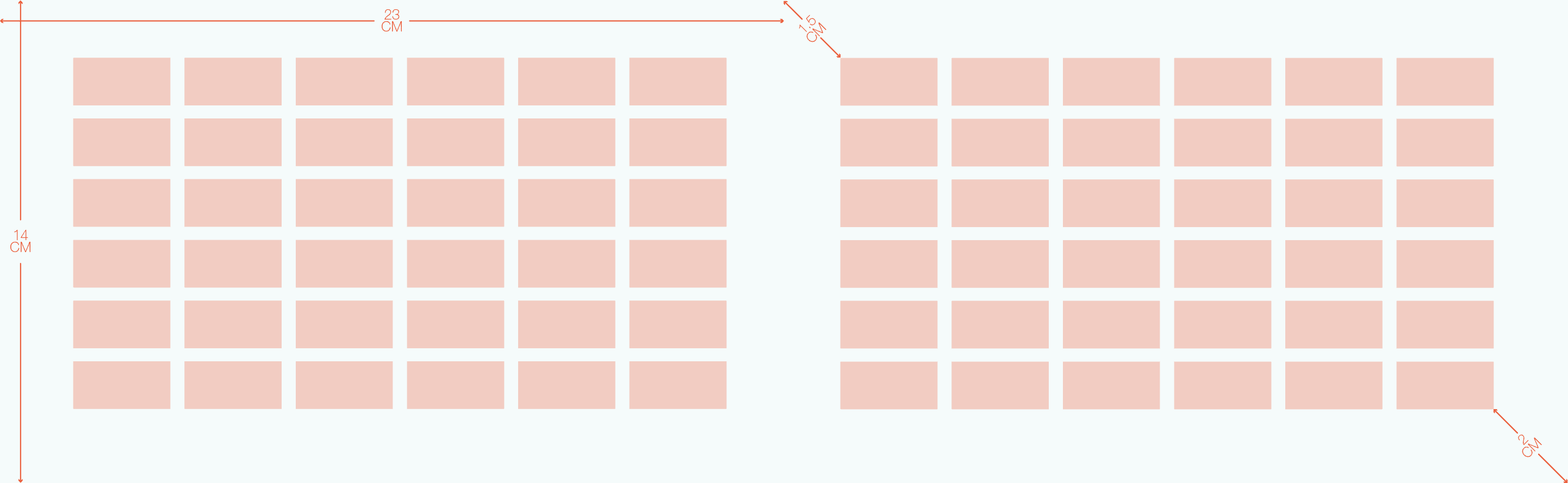
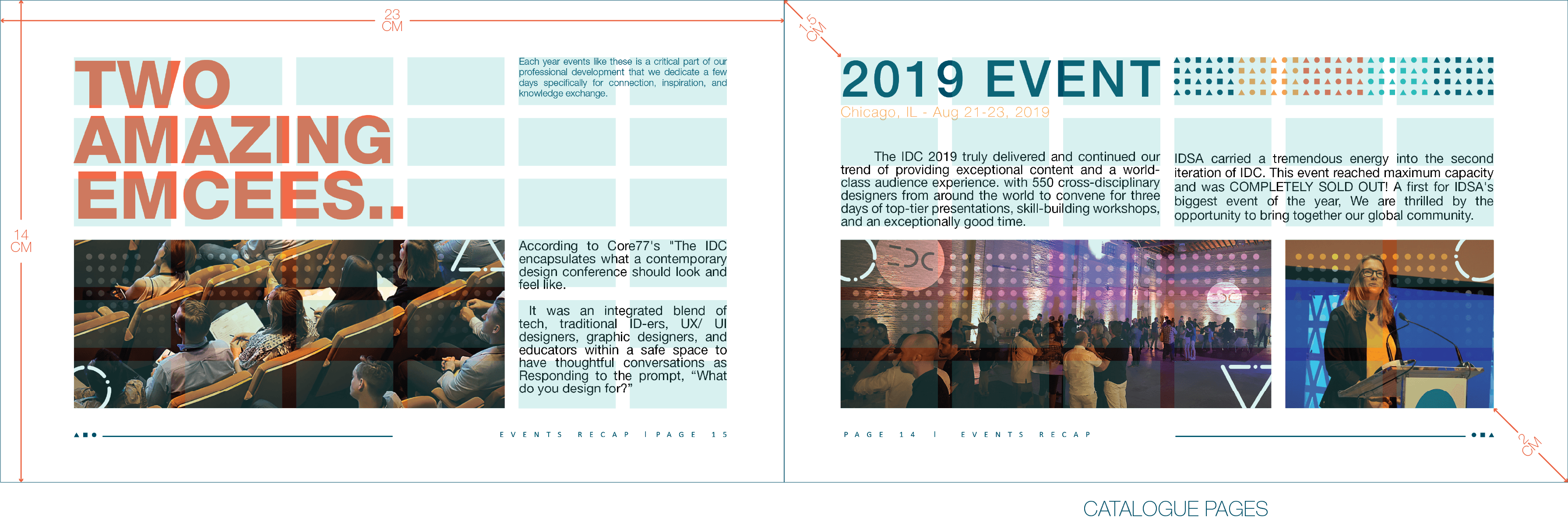
We used the 6x6 grid system which we established earlier, and here are two pages showing how the content has been organized according to the grid system.
We used the 6x6 grid system which we established earlier, and here are two pages showing how the content has been organized according to the grid system.
5.2 Catalouge
& Flyers.
5.2 Catalouge
& Flyers.
5.2 Catalouge
& Flyers.
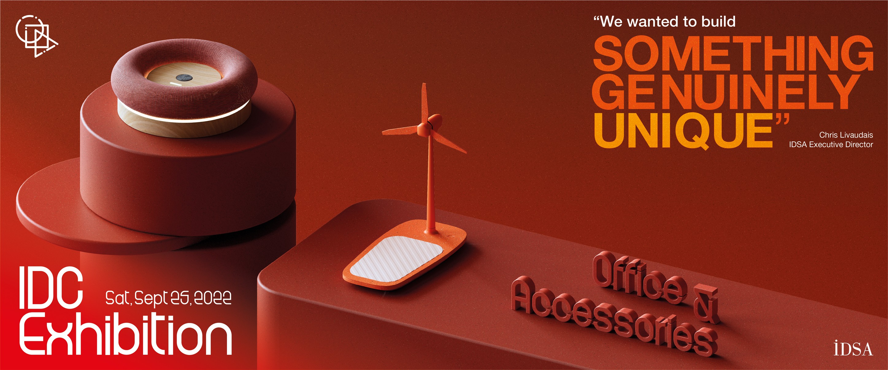
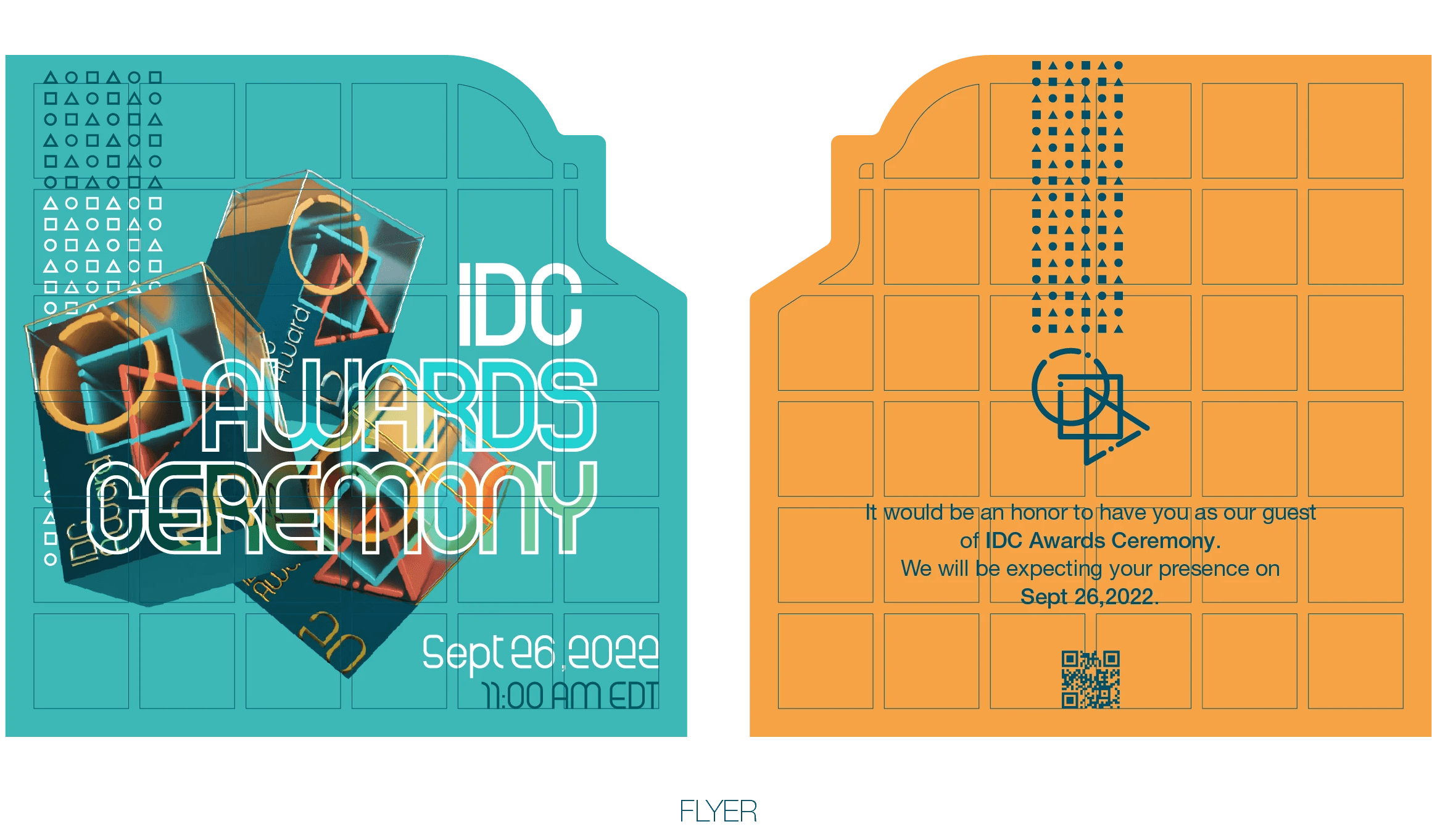
Flyers are a method to deliver simple messages or to use as an invitation card.
Flyers are a method to deliver simple messages or to use as an invitation card.
5.3 Event Items
Guidelines.
5.3 Event Items
Guidelines.
5.3 Event Items
Guidelines.
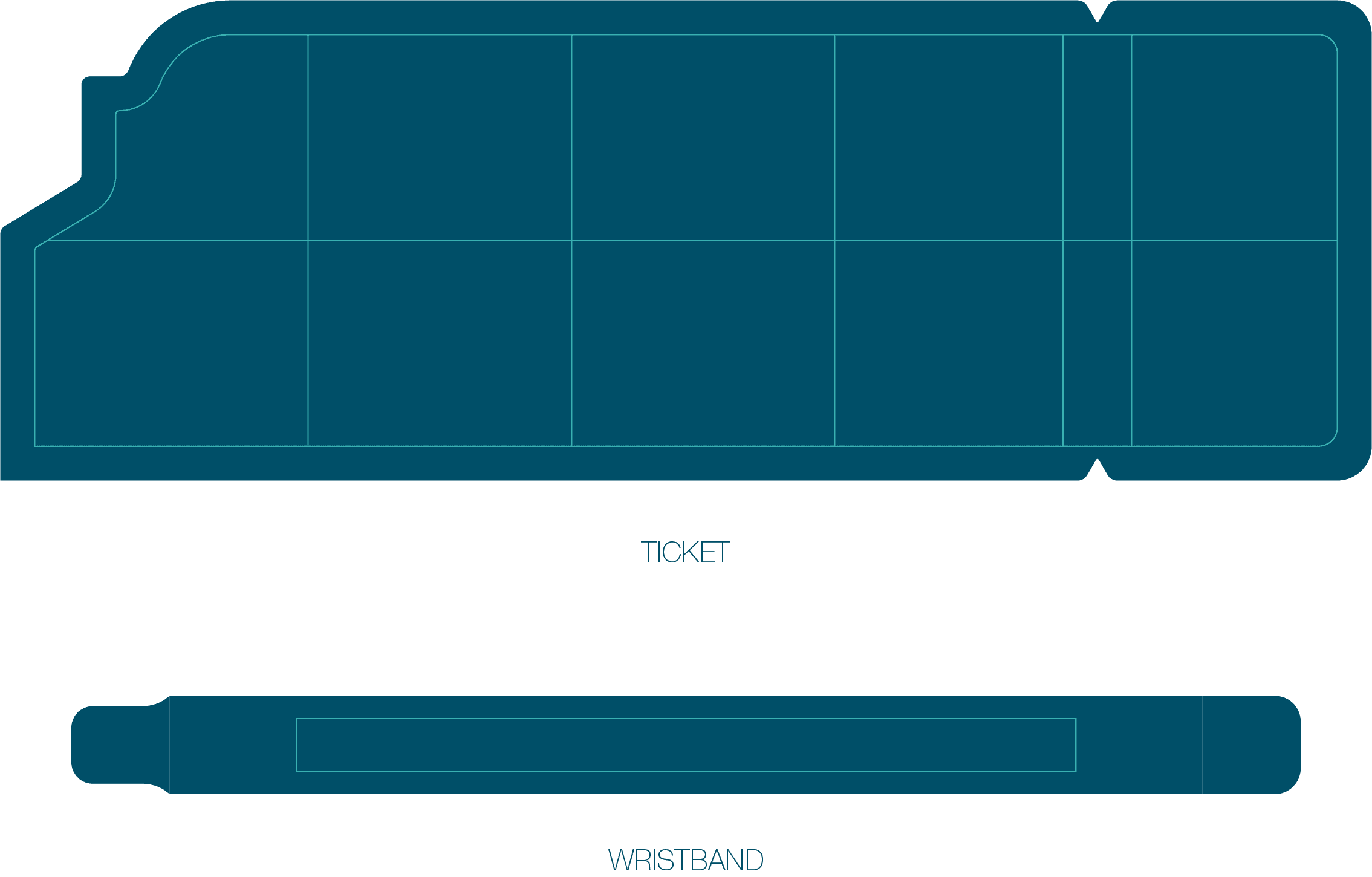
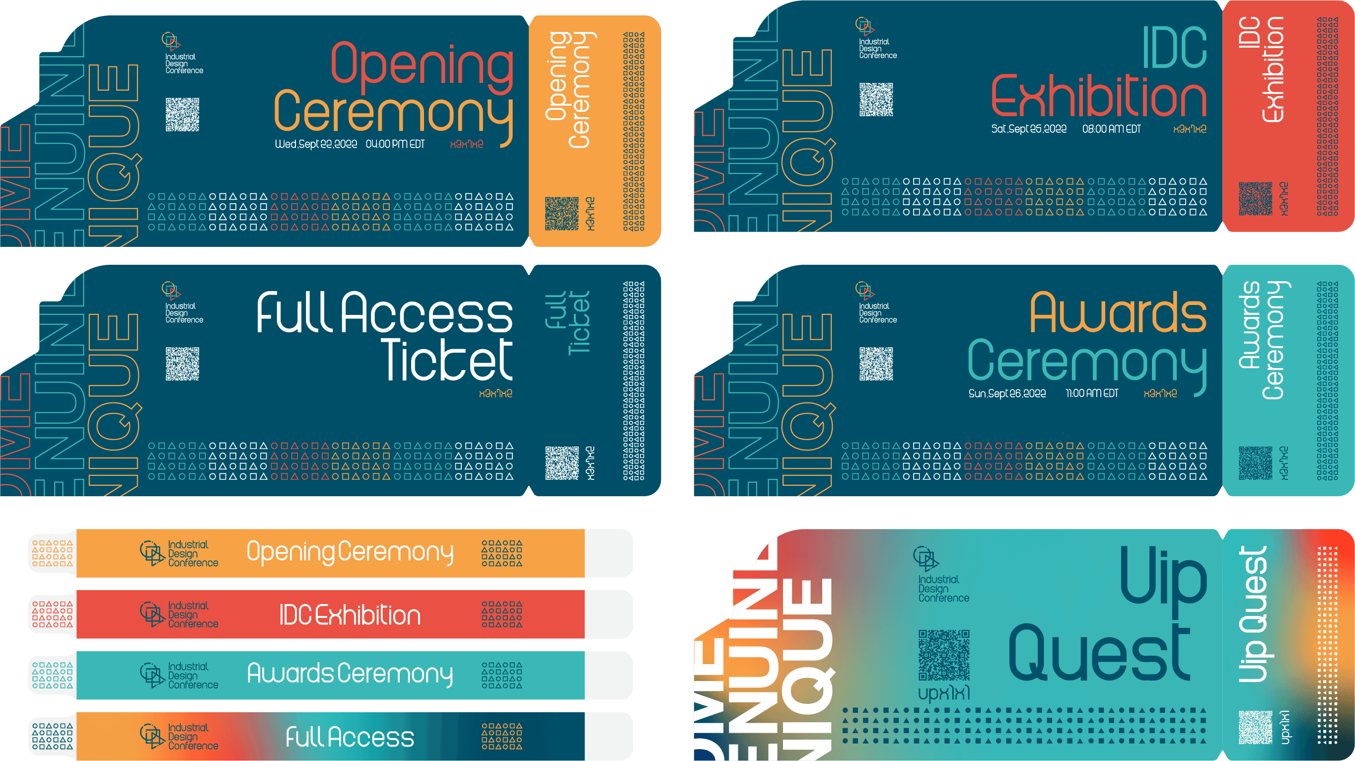
Items like tickets and wristbands are more than just organizing items, they could be a great souvenir people keep to remember the amazing time they spent.
Items like tickets and wristbands are more than just organizing items, they could be a great souvenir people keep to remember the amazing time they spent.
5.3 Event Items
Guidelines.
5.3 Event Items
Guidelines.
5.3 Event Items
Guidelines.
That's how they should look like when you apply your brand theme to them.
That's how they should look like when you apply your brand theme to them.
6.
Advertising
Its
Show Time!
Its
Show Time!
Its
Show Time!